The science of colour (or for Americans color) shares with that of music the property of being an attempt to describe aspects of our physiological and psychological reactions to physical stimuli in situations where the physical stimuli have fairly simple mathematical relationships but the limitations and complexities of our sensory (and signal processing) apparatus cause us to try to fit them into a simpler framework in a way that paradoxically actually makes the analysis even more complicated. (The complication seems to me exacerbated by the fact that people have come up with somewhat conflicting models for simplifying different aspects of the situation but some people are led by popular accounts to treat these simplified models as absolute dogma – and so lots of effort gets expended in going from one to the other rather than seeing how they all arise from different ways of approximating the true story.)
In music, this is exemplified in the issues of harmony, chord, and discord (well-tempered vs equal-tempered scales for example), but here I want to concentrate on colour (where arguments about “primary” colours and which is the true “colour wheel” can waste a lot of time).
Observed Facts and The Physical Basis of Colour
White(ish) light from any source, when passed through a prism (or drops of water in the air), spreads out into a range or spectrum of coloured components.
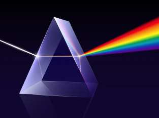

People sometimes interpret the colours of this rainbow as distinct named bands (ROYGBIV, for example), but different people and cultures have come up with different numbers of bands and it appears that the range is truly continuous. Once light has passed through a prism, the output from a narrow part of the spectrum does not spread further when passed through a second prism, and this suggests that each point in the spectrum corresponds to a different basic kind of light – each with its own refraction angles.
The fact that similar spectra can be produced by passing the light through (or reflecting it off) a grid of parallel lines suggests that light is transmitted like a system of waves with the various kinds of light in the spectrum just corresponding to different wavelengths, and that the set of all physically possible kinds of light just corresponds to the set of all possible frequency distributions in the “fourier transform” of the signal.
Basic Psychology of Colour Perception
The pure frequencies of the spectrum are all seen by (most of) us as having different colours, but similar-looking coloured light from other sources sometimes can be split. For example, yellow light from the spectrum can be matched by a mixture of red and green, and violet light from the spectrum can be matched by a mixture of blue and a small amount of red. But there are also deeper purples and magentas that can be achieved by mixing red and blue which do not seem to match anything in the spectrum. By reviewing our own experience and comparing with that of experimental subjects we find that every kind of light gives a colour experience that can be at least approximately matched by some combination of three given sources so long as they include one that is predominantly at each end of the spectrum and one in the middle. The question of how to compare quality of matching (eg the number and choice of samples to compare and the brightness at which they are shown to the experimental subjects) is not very well defined and so it is not surprising that results differ, but there are a few widely used choices of Red, Green, and Blue phosphors that have over time come to be accepted as adequate.
Biological Facts and the Neurological Basis of Colour Perception
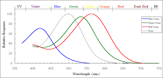
Examination of the human retina under a microscope shows the presence of various kinds of cells which further study shows to emit electrical signals in response to light. Some of these (the “rods”) are sensitive to all kinds of light and give about the same strength of signal to all of the frequencies in the spectrum of sunlight. Others (the “cones”) are more sensitive to some frequencies than others (and generally less sensitive overall).
Most people have three kinds of cones. One kind have their peak response towards the long wavelength end of the spectrum; some people used to call these the “Red-sensitive” or R cones but nowadays the fashion is to call them the L cones because even though they peak at longer wavelengths than the others they still fall off in the region of the spectrum that we see as bright red (so the strength of the L cone signal cannot be all that contributes to our sense of redness). The second group, which peak closer to the middle, are sometimes called “Green-sensitive” or G cones, but I will join those who refer to them as M cones instead. And for the third group, which peak nearer the short wavelength end and are sometimes called “Blue-sensitive” or B cones, I will follow the convention of calling them S cones and denote the strength of their signal by S.
It is not easy to measure the actual signals output from cone cells, but it is possible to extract the light sensitive chemicals and measure how their light absorbing properties depend on frequency and intensity of the incident light, and we may perhaps take this as a plausible proxy for the actual output signals. Here’s one plot of how the energy absorption of each type of cone depends on the wavelength when the intensity is relatively low so as not to “saturate” the effect.
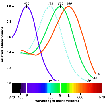
(Other sources may give somewhat different shapes because of using different methods for extracting the relevant parts of the cones and/or different illumination levels but the overall pattern seems to be similar in all cases.)
Note that the S signal (or at least the absorbance that we are taking as its proxy) is relatively weak, but this doesn’t necessarily mean that we see blue colours less vividly (though they do appear to fade more quickly in dim light) because our brain may respond more strongly to signals from the S cones . For this reason the above graph also shows the normalized values L^,M^, and S^, where for each of X=L,M,S, X^=X/X_max
Also, perhaps more significantly, we can see that the L signal is peaked quite close to the M and falls off a lot before the red end of the spectrum. So why do we nonetheless see true reds as quite vividly coloured?
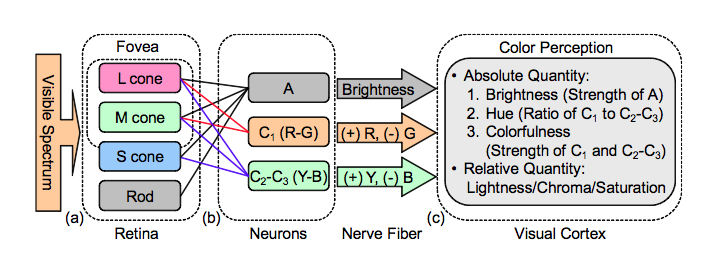
One possible explanation (partly but not yet completely confirmed by actual analysis of optic nerve and brain neural connections – and also supported by psychological experiments in which people report how vividly coloured different light sources appear) is that the signals we identify as colours are calculated in terms of the percentage differences between L, M, and S signals rather than as those numbers themselves.
For example if we define R=2(L^-M^)/(L^+M^) , R^=R/R_max, B=2(S^-R^)/(S^+R^), and B^=B/B_max, (which can all be produced by running the LMS signals through a fairly simple sequence of neurons)
then the positive values of the R^ signal peak much further to the red end of the spectrum (and the negatives G^=-R^ and Y^=-B^
[insert graph of R^ and B^ signals, along with G^=-R^ and Y^=-B^]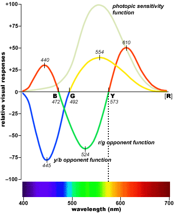
This means that for any light source our sense of the colour and brightness of that source can be represented either by three positive numbers L,M,&S (actually four if we count the rods response) or by two signed numbers, RG and BY, for the colour and one positive number for the brightness.
Working in terms of the cone signals directly, we could represent all possible cone signals from each patch of the retina by points in (the first octant of) a 3d space (with one axis corresponding to the signal strength from each type of cone). Since scaling up all the strengths just corresponds to an increase of overall brightness we can identify the colour hues with the directions or with points on the first octant of a sphere of some fixed radius – which viewed from the middle direction looks like a triangle.
[insert rotatable 3d image of spherical surface in 1st octant of LMS space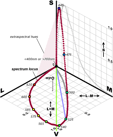
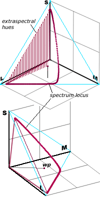 and its triangular projection]
The corners of this triangle represent excitation of only one kind of cone – which might in principle be achievable by some chemical stimulus (or suppression) of specific cone types, [or by targeting impossibly fine laser beams on individual cones!*], but not by any kind of actual uniformly spread out light since light of every pure frequency causes at least some stimulation of all three cone types (and in particular the L and M responses are generally quite close to one another)
This means that the set of response triples that can actually occur as a result of stimulation by light is just a small part of the triangle. It includes, of course all of the response triples that can be stimulated by pure frequencies (which correspond to a curved line in the response space – curved because most spectral frequencies that stimulate both L and S also stimulate M so the corresponding points are not on the straight line joining the two endpoints) as well as any kind of weighted combination of those points. For any light source with spectrum of energy per unit of wavelength given by s(
which gives us what is called the “convex hull” of that curve of pure frequencies.
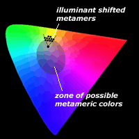
Except for the pure spectral colours, every physical colour spectrum has many others that give the same LMS responses and so look the same to us.
On the other hand, if we represent each LMS triple by its corresponding RG and BY values then we get a “map” of the spherical surface which spreads things out much more clearly
[insert image of the RG vs BY horseshoe]
Every point in the original LMS triangle now corresponds to a point in the R^G^xB^Y^ coordinate plane but the coordinates are now much more closely related to our actual sense of “primary” colours and the part that corresponds to actual colour responses is more symmetrical (closer to being a circle)
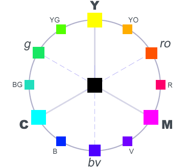
Complementary and Contrasting Colours
Two coloured light sources that combine to make something that looks white are said to be complementary (where the word “complementary” with an ‘e’ refers to parts making up a whole, as opposed to “complimentary” with an ‘i’ which refers to making the other look good – or at least saying that it does).
While many people think of complementary colours as the most natural way of defining contrast, there may also be some reason for thinking that our sense of contrast is driven more by the results of the RG YB transformation and so to define contrast in terms of an RYGB colour wheel
Colours of Objects and Pigments
So far I have only been discussing the colours of light. But the colours of objects and pigments are a lot more complicated. This is because, although at the physical level the absorption/reflectance spectrum of an object or pigment is no more complicated than the spectrum of a light source, the colour we actually see from it depends on both its absorption/reflectance spectrum and the spectrum of the light with which it is illuminated. So, by seeing it under different lighting conditions we can with just our three kinds of colour cones learn far more about the detailed absorption/reflectance spectrum than just three weighted integrals.
Also, the mixing of pigments does not always just correspond to adding their absorption spectra. Depending on how the coloured particles are distributed and on whether the medium in which they are embedded is light dark or clear it may be either the absorptions or the reflectances (or some combination) that get added.
Most printer inks are designed to add their absorbancies in proportion when mixed and to be seen under a standard daylight spectrum and for that purpose is serves well to have fundamental pigments that are complementary to the RGB components used for analysis of the reflected light – namely Cyan, Magenta, and Yellow. Going beyond that basic statement takes us into the domain of the club of serious colour specialists – of which I am not a member. (But see also this discussion of what some of those experts say)
*Note: This has actually been done! See this paper which I first heard about here
One thought on “Colour”